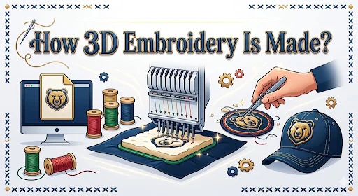
3D embroidery looks like a simple upgrade until you’re the one approving the proof and wondering why the letters look chunky, the corners look round, or the patch feels thicker than expected. That’s not “random.” It’s the result of how puff embroidery is built, digitized, stitched, and trimmed.
If you understand the process, you’ll order Custom 3D Embroidery Patches like someone who’s done this before. If you don’t, you’ll end up chasing revisions, switching styles mid-order, or blaming the patch when the real issue was the artwork.
The best vendor for custom patches is the one who explains what puff can and can’t do before you pay, not after you’re staring at a patch that doesn’t match the vision..
First, What Counts as 3D Embroidery
Most 3D embroidery is puff embroidery. Foam sits under the stitch area, stitches compress it, then excess foam gets trimmed. The raised effect comes from three things working together:
- Foam thickness
- Stitch type and density
- Digitizing choices that control coverage and direction
If you want the basics of what 3D embroidered patches are and where they work best, keep this one as your reference and come back here for the making process: What Are 3D Embroidered Patches – A Practical Guide for Brands!
Step 1: Artwork Prep and Choosing What Should Be Raised
Before a machine touches thread, somebody has to decide what parts of the logo get the 3D treatment. Not everything should be puffed.
Good candidates for puff
- Big lettering
- Block shapes
- Simple icons
- Clean numbers and initials
Bad candidates for puff
- Tiny text
- Thin outlines
- Hairline detail
- Small interior shapes inside letters
This is where hybrid builds come from. Puff the main letters. Keep small text and fine details flat. Hybrid is how brands get the “pop” without wrecking readability.
Step 2: Digitizing for Puff Embroidery
Digitizing is where 3D embroidery gets made or ruined. A logo is not a stitch plan. Digitizing turns your artwork into instructions the embroidery machine can follow.
For puff, digitizing has extra jobs:
- Control density so stitches cover foam cleanly without cutting through it
- Choose stitch direction so the raised surface looks smooth, not choppy
- Build strong edges so letters look sharp, not lumpy
- Leave breathing room so puff doesn’t crowd the design
Most puff uses satin stitches on top of foam for custom 3D embroidery patches because satin covers foam well and produces clean raised edges. Fill stitches can work in some cases, but satin is the common “safe” method for bold lettering.
Real-world detail:
Small lettering often needs to be redrawn slightly for puff. If a vendor refuses to adjust anything and says “we can puff it all,” that’s not confidence. That’s a future headache.
Step 3: Foam Selection and Placement
Foam is what gives puff its height. Foam comes in different thicknesses, and thicker foam means more height, but also more risk if the design is complex.
Foam thickness impacts
- How high the puff looks
- How round the edges become
- How well corners stay sharp
- How durable the raised area feels
The foam is placed only in the areas meant to be raised. If it’s a hybrid design, the foam gets used under the main letters and not under the fine details.
This step is also where placement mistakes show up. If foam shifts, the puff can look uneven. Good production keeps it stable.
Step 4: Stitching Over Foam
This is the “magic” part, but it’s also where physics shows up.
The machine stitches over foam, compressing it into shape. If the stitching is too loose, you’ll see foam peeking out. If it’s too dense or too tight, it can cut the foam and flatten the puff.
Common stitch issues in puff
- Foam showing at edges
- Uneven height across letters
- Rounded corners that should be sharp
- Stitch gaps on wide shapes
A strong stitch plan balances coverage and tension. That balance is why a puff from a good shop looks clean and puff from a random vendor looks like a pillow fight happened on your hat.
Step 5: Trimming and Clean-up
After stitching, the foam that sticks out gets trimmed away. This is what makes puff look professional.
Trimming can be done by hand or with tools depending on the setup, but either way, clean trimming is what gives puff those crisp letter edges.
What clean trimming looks like
- No foam peeking out
- Edges look intentional and smooth
- Letters keep their shape
- No ragged foam bits stuck under stitches
If your sample patch has foam showing, that’s usually not a “small issue.” It’s a production quality issue.
Step 6: Backing and Finishing the Patch
Puff is the front-side effect. The patch still needs finishing: border style, backing, and any add-ons like hook and loop.
Backing choice depends on how it will be used. If you want the full breakdown of backings and borders across patch types, this guide is the one to use: Custom Patches Breakdown: Types, Backings, Borders & More!
For 3D embroidery patches, the most common backings are:
- Sew-on for permanent applications
- Iron-on for faster application on heat-safe fabrics
- Hook and loop for removable patches
The wrong backing can ruin a great patch, especially if it’s going on gear that gets washed hard or worn daily.
3D Embroidery vs Regular Embroidery From a Production View
Most people compare these by look. Here’s the production side:
- Regular embroidery is more forgiving with detail because it doesn’t rely on foam height.
- Puff embroidery is less forgiving because foam introduces thickness, rounding, and spacing constraints.
If you want the straight comparison for choosing between the two, this supporting post covers it cleanly: 3D Embroidery vs Regular Embroidery – Which Patch Wins?
Quality Checks Before You Approve a 3D Embroidery Proof
A proof is not just “does it look cool.” Check these specific things:
- Are the letters thick enough to puff without collapsing
- Is the spacing wide enough so puff won’t crowd edges
- Are corners designed to stay sharp, not skinny spikes
- Is small text kept flat, or removed entirely if it won’t hold up
- Is the patch size big enough for the design density
Puff loves bold, simple shapes. If the proof shows tiny text puffed, stop and revise.
Where 3D Embroidery Is Most Worth It
If you’re choosing puff, choose a use case that actually benefits from height.
A good reference list for placements and products is here, and it’s worth reading if you’re still deciding where puff makes the most sense: Best Use Cases for Puff Embroidery on Hats and Heavywear.
In short, puff makes the most sense on structured hats, outerwear, and big lettering where the raised effect reads clearly.
FAQs
Make Puff Look Clean On Purpose
3D embroidery is not hard, but it is picky. Bold artwork, smart digitizing, stable foam placement, clean stitching, and tight trimming are what separate “premium” puff from “puffy chaos.”
If you want it done right the first time, share your logo, patch size, placement, and deadline, the Prime Emblem skilled team will tackle the rest for you.