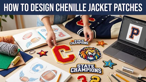
Chenille jacket patches look simple when they’re done right. Big letter, clean outline, solid contrast, and that plush texture that basically screams varsity. But designing them is not the same as designing a logo for a website. Chenille has limits. Ignore them and your patch ends up looking fuzzy, crowded, or weirdly cheap.
Here’s the mindset that saves money: work with a premium patch maker who tells you what chenille can’t do before production starts. That’s how you avoid “looks great on screen, looks off on the jacket.”
If you want a quick refresher on where chenille is used and why it’s such a staple, this post is the starting point: What Are Chenille Patches and Their Top Real-World Uses.
Step 1: Decide What the Patch Is Supposed to Do
Don’t start with colours. Start with purpose.
A chenille jacket patch usually falls into one of these buckets:
- A Big Varsity Letter for the chest
- A Mascot Icon for the sleeve
- A Year Patch for achievements or seasons
- A Back Patch that anchors the whole jacket
- A Name or Role Patch that sits with the main letter
If your goal is a classic varsity build, you’re basically designing Custom Varsity Letter Patches with extras. If you’re doing streetwear, you’re designing for vibe and contrast first.
Step 2: Choose the Right Patch Layout for Chenille
Chenille doesn’t reward complicated layouts. It rewards strong shapes.
Layouts that work
- Single bold letter with a clean outline
- Two-layer letter with a contrast border
- Letter plus a small embroidered element like “EST 2004”
- Icon with big shapes and minimal interior detail
Layouts that usually fail
- Detailed crests with tiny line art
- Small text-heavy designs
- Logos with thin strokes or lots of little cut-ins
- Anything that needs gradients or shading to look right
If you’re on the fence between chenille and embroidery, this comparison breaks down why certain designs should not be forced into chenille: Chenille vs Embroidered Patches: Which One Fits Your Demand?
Step 3: Pick the Right Size for the Jacket Placement
Sizing is where most people mess up because they guess.
Quick sizing references that work in real life
- Chest varsity letters often land around 4 to 6 inches tall
- Sleeve icons often land around 3 to 4 inches
- Back patches can go large, but the jacket panel decides
Best move:
- Put the jacket on a table
- Mark the placement with painter’s tape
- Measure the actual usable space
- Choose size after that, not before
Chenille needs breathing room. If you shrink it too much, it stops looking premium and starts looking like a fuzzy blob.
Step 4: Nail Contrast First, Then Choose Colours
Chenille jacket patches live or die on contrast.
A strong chenille patch usually has:
- One dominant yarn colour
- One felt base colour that frames it
- One outline colour that sharpens the edge
Too many colours can make chenille look messy. If you need a lot of colours because the logo is complex, chenille might not be the right style for that patch.
Pro tip that keeps designs clean: build the patch in black and white first. If the shape reads clearly without colour, it will work in chenille.
Step 5: Decide where embroidery fits into the design
Even when you’re designing Custom Chenille Patches, embroidery is often the secret weapon.
Embroidery works best for:
- Outlines that make edges crisp
- Small text like a year or city name
- Thin details that chenille can’t hold
- Borders that separate layers visually
This is how most “premium” varsity letters are actually made:
- Chenille for the main letter
- Embroidery outline for sharpness
- Optional embroidery for small details
If the design needs a lot of fine detail, flip the approach:
- Embroidery does the detail
- Chenille becomes a background texture, not the whole patch
Step 6: Choose Shape and Border Style That Won’t Fight the Jacket
Chenille patches can be:
- Simple shapes like circles, shields, rectangles
- Custom cut shapes that follow a letter or icon outline
For jacket patches, simple shapes often look more “official.” Custom shapes look more modern and streetwear-friendly.
If you’re using a complex custom shape, keep the outline thick enough so it doesn’t look jagged or wobbly once stitched.
Step 7: Pick the Attachment Method for Jacket Reality
Jackets are heavier. Chenille patches are thicker. Don’t treat this like a T-shirt patch.
Most common options:
- Sew-on for long-term wear and classic letterman builds
- Iron-on for faster application, often reinforced with a stitch around the edge
- Hook and loop only when you need removability
Backing and borders matter across every patch type, not just chenille. This is the main reference for that bigger picture: Custom Patches Breakdown: Types, Backings, Borders & More!
Step 8: Proof Checklist Before You Approve Anything
A chenille proof should answer these questions clearly:
- Does the letter or icon read instantly at the chosen size
- Are outlines thick enough to look clean, not fuzzy
- Is the contrast strong enough to pop on the jacket colour
- Are the layers balanced, not bulky
- If there is small text, is it embroidered and readable
- Does the shape fit the placement area you measured
If anything looks crowded on the proof, it will look worse on the jacket.
Common Mistakes When You Design Chenille Jacket Patches
- Making the letter too thin because it looks stylish
- Picking colours with low contrast that blend together
- Skipping outlines and wondering why edges look fuzzy
- Trying to fit a detailed logo into a small chenille patch
- Using iron-on only on heavy jackets without reinforcement
If you avoid those, you’re already ahead of most first-time orders.
Frequently Asked Questions
Make It Look Like It Belongs on the Jacket
If you want your patch to feel like a real varsity piece, design for bold shapes, strong contrast, and clean outlines, then choose the backing that fits how the jacket will be worn. Share the jacket type, placement, and your artwork, and our team at Prime Emblem can steer you toward a chenille-only build or a chenille plus embroidery combo that looks sharp on day one and still looks good after a season.